Title here
Summary here
There are two main types of gradients we’ll talk about in this lesson: Exterior Gradients and Interior Gradients.
Exterior Gradients transition from one color to nothing at all, such as when found on the outside of a block. The most common examples of this are blending, but non-blending examples exist and have their place to be used.
Some examples of these are in Deadlocked by Robtop and Culuc’s part in Edge of Destiny.
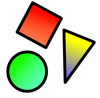
Interior Gradients transition from one color into a new one. There are three main types of these.
• Non-blending to Non-blending: These are the easiest to do; making them just requires some neat color/opacity tricks. They are the best for more complex shapes, which have a lot of overlap inside them.
• Non-blending to Blending: These are a bit more difficult. We recommend making the gradient focus more on the non-blending color for best results, because blending with overlap can look very messy. If it helps, you can also add another gradient on top to make the colors more vibrant.
• Blending to Blending: These are the most difficult and we don’t recommend them complex shapes because of overlap. Overlap can make these look messy and is hard to avoid with limited shapes and object options.
Some examples of these are Woom’s part in Koenigstein (inside the blocks), and Xender Game’s part in Dream Flower.
None
Here, we’ll explain how to actually make gradients.
Geometry Dash has pre-existing gradients in the editor, known as “glow”: These are often the most common objects; they have many uses from large full-screen gradients to outlining complex shapes and can greatly influence a level’s appearance if used right.
Objects with poor aliasing have become more popular recently as well. These appear blurry or pixelated, especially when scaled up. This means they are quite good for constructing shapes; it can be more efficient to just use blurry objects instead of outlining the shapes in glow. Most of these require partial masking to work, so you need to be aware of the different selection boxes.
There are two main ways of making custom gradients.
The first method works as follows: you start by defining the borders of the colors using hard edges, then use glow to soften that edge and make a gradient. This makes a smooth gradient but if you don’t space out the glow evenly, it can look very choppy.
The second technique uses ‘afterimages’.
If you select the objects you’re using and make copies of them, you can move these objects a bit and alter their opacity to make a gradient. This can be faster than the prior method, but is a lot more object intensive as well.
Be intentional with when you use gradients. If you use too many, you’ll make your work become blurry, hazy, or worse. Only use them in the most impactful areas.
Additionally, you should play around with how you use gradients. You can stack them to make your shapes appear as if they’re brightly glowing, or you could use them to form new shapes entirely.
 and
ThunderBat.
and
ThunderBat.