Title here
Summary here

TLDR - What this guide covers
This is an advanced guide.
Evenness is one of the two biggest design concepts, along with Hierarchy. To explain it shortly, evenness is dividing a design element into similar parts. This guide will explain its importance for design and how you can improve your work by being aware of it.
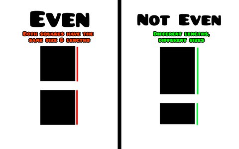
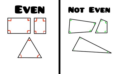
In simple terms, evenness is when a decoration element lacks contrast. If you have two lines with the same length, they’re even. The same goes if you have two shapes with the same size, amount of detail, and so on.
This matters because evenness makes your deco less dynamic. It’s fine to have some evenness as you’ll see later, but too much of it makes your deco feel boring and unnatural. For instance, if you look at the real world (yes, that means going outside), objects in nature rarely have evenness. Making your deco more dynamic helps guide the eye around, which makes things more interesting. As such, that means avoiding evenness.
Additionally, evenness makes it hard to “read” your deco. With the squares in the image above, it’s hard to tell which square is more important on the left side. On the right side, since one of them is clearly larger than the other, it’s easy to see which one is more important.
Basically, avoid perfectly dividing things in two, and make sure you have clear contrast.
While it’s effectively impossible to remove all evenness from your deco, reducing it as much as possible will greatly help your design skills.
Evenness can occur with any design element. Here are some examples of it occurring.
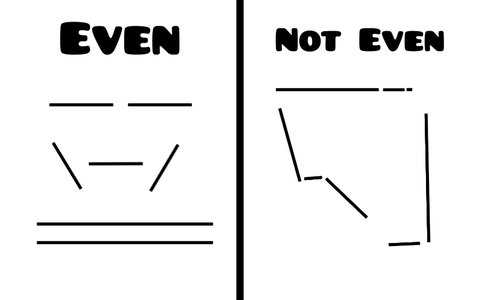
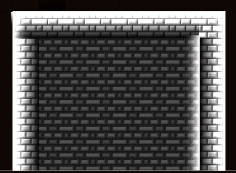
Lines: Lines with the same length are even. This also applies to the lines that make up shapes, such as in the image above.
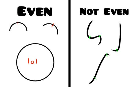
Curves: Curves with clear symmetry are typically even. This is a clear example of evenness making deco less dynamic, as the curves on the right side direct the eye much more effectively.
Angles: Shapes with the same interior angles inside them are even. This occurs frequently for good reason in manmade designs (e.g., squares & rectangles) but is much harder to find in nature.
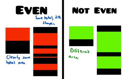
Size: Shapes with the same size are even. The example above shows this pretty clearly. However, this can also apply to shapes that look completely different but take up the same area.
Color: Colors that take up the same total area on screen are even. This is similar to the size example, but the colors don’t have to be directly next to each other for this to happen.
Detail: Objects with the same level of detail are even. This also applies detailing methods such as rendering and texturing.
There are many common ways for evenness to unintentionally sneak itself into your levels. The image below has a few examples of it; try to find them for yourself before moving on.

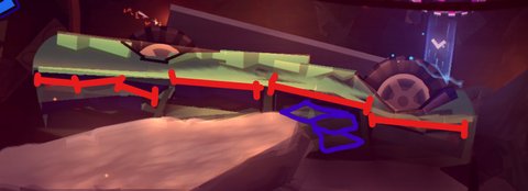
This occurs when you have many even details in one area.
Usually, sandwiching is a result of bad detail grouping, meaning your details are evenly spread out. This is why the Making Blocks guide recommends placing most details at the edges and corners of blocks; it helps group details better and avoid sandwiching.
Sandwiching is very noticeable on the wrecked car model in the image above. The red lines represent areas with the same length, while the purple areas have similar sizes.
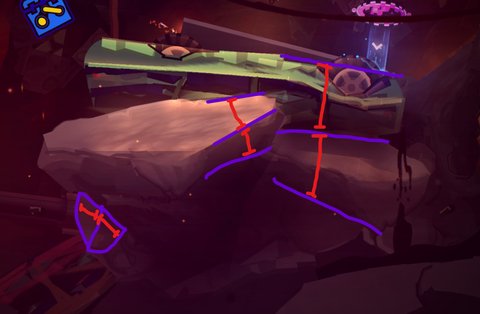
It is typically easier to notice evenness when it occurs with horizontal or vertical parts – for instance, shapes that are neatly lined up perfectly. But evenness doesn’t always occur in such neat ways. Sometimes, evenness occurs with diagonals and in other subtle ways.
This can be especially common with shapes like triangles, and it’s particularly hard to remove because of how those shapes work.
The rocks in the image above contain many of these hidden lengths. The shapes where they occur are highlighted in purple, while the actual evenness is marked with the red lines.
Complex deco has far more moving parts, which makes it that much easier to introduce evenness on accident.
The examples above are both caused in part by complexity. Had I made the decoration simpler in those examples, the sandwiching and hidden lengths might have been easy to avoid.
This section goes over how to spot evenness in your work, ways to fix it, and some notable exceptions to the theory.
While avoiding evenness is important, it’s not the end of the world if you have some in your work. Additionally, the way you try to fix it can lead to more problems down the line if you aren’t careful.
As such, it’s important to tackle these techniques in order, and learn them after you already have the skills to comfortably decorate.
The only way to get good with identifying evenness is to constantly see it at work. Take the images below, save them to your device, and use a software to mark all the evenness you can find. Each example will only get more difficult, so master the simple examples before moving on.
I recommend starting by trying to identify shapes with even lengths or widths. Then, try to identify shapes with even sizes. Afterwards, you can focus on identifying colors with an even total area, and objects with even detailing.

One funny side effect of this practice is that you may start noticing evenness everywhere in real life, and associating it with the same methods you use to annotate it.
There are a few ways to fix evenness, each with their own pros and cons.
There are a few instances where you should actually ignore evenness in your work, or introduce it intentionally. It takes experience and skill to know when to ignore it, but some scenarios are listed below.
While it’s important to have dynamic deco, having “too much” can become way too chaotic. Intentionally duplicating and reusing a detail in your deco can make it feel more unified.
For instance, if you have thirty different types of spikes in your level, it becomes much harder to process since many different pieces of deco serve the same function. It’s more effective to use only two or three spike designs in a part, so there isn’t as much to process.
The image below does just this. The spikes and saws are reused through the part. Additionally, the design in the top left features some clear repetition. Not only does this save time (since I can just use
 ), but it also prevents the deco from getting too chaotic.
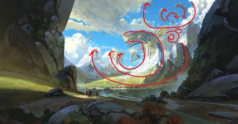
Echoing is similar to repetition, but not exactly the same. While repetition is repeating the exact same element or detail, echoing is repeating the same idea in your work. Just like repetition, this helps make your deco more unified, though it is more advanced as it allows room for more variety and complexity.
An example of echoing is this art by Sin jong hun. The ruins, buildings, and even the environment reuse the idea of concentric circles. While this idea appears in very different contexts (such as manmade structures and nature), the general idea is reused multiple times.

Here’s a breakdown of some echoing in this art.
Directionality is basically how objects “point” in a direction.
For instance, a circle doesn’t “point” in a direction because it doesn’t have any points. However, a triangle (e.g., an arrow symbol ➡️) shows direction.
While this is incredibly useful for shape design and composition, as you’ll see in later guides, it’s also important to have some “rest areas” where your eyes aren’t constantly being moved around. This way, you aren’t constantly overwhelming viewers.
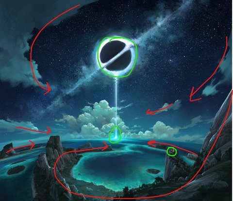
Here’s another example by Sin jong hun. While there are many shapes that convey direction in this art, there are also many rest areas.

Here’s a breakdown of some rest points, which are marked in green.
Rhythm is similar to directionality, but more general; you lead the viewer’s eye around by creating patterns in your work. Intuitively, this requires some sort of repetition or echoing.
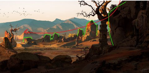
Here’s an example by Zhu Weiwei. The rocks in the foreground and background are arranged to lead your eye through the scene. They all share similar shapes, lighting, color, and texture, which helps make this more effective.

As before, here’s a breakdown.
Symmetry is likely the most intuitive of these concepts – you directly mirror an object along one or many axes. There are many types of symmetry (e.g., reflecting objects across lines vs. rotating them around points), but they all involve some sort of repetition.
Importantly, when used right symmetry can be a very powerful tool. For instance, a manmade building with clear symmetry can stand out against an environment with no such symmetry.
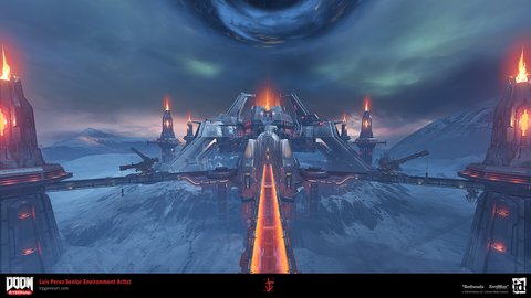
Symmetry can be seen frequently with objects such as entrances and doorways, but a specific art example is the DOOM Hunter Base from Doom Eternal. Its clear symmetry helps it stand out against the asymmetry in the background.
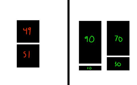
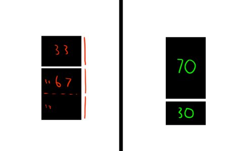
Let’s say you’re dividing an object into two parts. As we’ve discussed, you’ll likely want to avoid a perfect 50:50 split (or ratio) between the parts. But is there a “best” ratio to divide your object with? This question is one I’ll “answer” here.
In reality, there is no “best” ratio as it depends on what you want. Obviously, a 50:50 ratio is even, meaning both parts will look the same. However, depending on the circumstances you may not want a ratio like 90:10 as it makes one object far too small.
However, there is a decent ratio you can use in a variety of circumstances: 70:30.
This ratio is incredibly effective for many reasons:
How do you generalize the 70/30 rule to more sections? Well, the answer is math!
After dividing an object into two sections, you can add a third section to it. Make sure this third section follows the 70/30 rule with respect to the second section (so you have another 70/30 ratio).
By doing so, you get another commonly used ratio: 62:27:11, or the commonly described 60:30:10 rule. This is more applicable to complex shapes and color distribution, since you’re more likely to use three colors, values, or shapes together than you are to just use two.
More generally, this “optimal ratio” is calculated with the following formula:
$$ S(i, n) = \frac{100 * (7/3)^i}{\sum_{i=0}^{n} (7/3)^i} $$
This essentially means that you start with the number 1, multiply it by $(7/3)^n$ times, sum the results, and then divide each individual number by that sum.
Since this is annoying to do for every individual set of numbers, I created an evenness calculator you can use to see these theoretical “best values” for yourself.
 .
.